Thursday, September 1, 2011

The Law School Apartment Mood Board


The pictures aren't ready yet. Shoot, not even all the stuff is in the apartment. But, rather than wait until winter break, I have a couple of mood boards to share. The second of which is closer to reality, with some of the Ikea furniture used. There are still a few fantasy pieces in it, the Layla and Grace nightstand, for example, this is an apartment on a budget, after all and a $680 nightstand isn't really in my budget, either!
You will notice that my daughter's style is not as beachy as the Ektorp white furniture. Nor as Belgian as their new grey-brown finish. She is more modern and opted instead for the black Hemnes finish. I thought that dual Hemnes dressers either side of the dresser would be perfect and eliminate the nightstand. She did the math and opted for the less expensive combination of nightstand plus 6 drawer chest.


We plan a few Ikea hacks, but they are minor touches, just changing out hardware. Possibly painting the nightstand yellow. Shhh! The student, my daughter, doesn't know I am anticipating that. I still have dreams of finding something at goodwill or consignment which can be used. Why am I the only person unable to score the $10 table? **Le sigh**
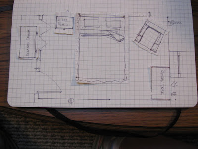
Below are a couple of the plans I drew in my moleskine gridded paper notebook. I love that notebook! Yes, professor, I have a few dimensionless walls!



Friday, August 5, 2011

Color, Color Everywhere


Available from Shades of Light


I am so ecstatic that color is back in a big way!
The chairs, above, were noted by Jeffrey Alan Marks at the Las Vegas Furniture Market. Thanks to Stylebeat, we got to see the webinar.


In fact this chair, with it's lovely green reminiscent of Mary McDonald's Master Bedroom and Bath home tour, also from Shades of Light might need to find a way home with me.


I was thrilled to see that the beige on beige with accents of beige look, though not dead, is being punched up with pops of color. I wish I could find a picture of the Belgian Look Book Case with the Honeysuckle Pink interior! Visualize this bookcase punched up with a pink interior. This has me so enthusiastic, I am creating fabric designs in Pantone's Honeysuckle Pink for use in my grey living room, rethinking the plan for the family room and considering where else I can add a punch of colour.


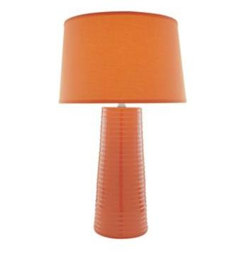
Since repainting my creative space Revere Pewter, the plan has been to add an orange lamp. Consider these lamps, the Gourd Lamp, on the right, has been my go to dream choice for a while, but the lamp on the right would work as well.

I hope this has inspired you to color your world!

Tuesday, June 7, 2011

Black, white, grey


I am absolutely in love with the furnishings and finishes in the country home owned by Ingrid Oomen. Suzanne Dimma takes us on a tour on the Canadian House and Home website. The simplified color palette of white and black is at once soothing and intriguing with a heavy dollop of sophistication ladled into the mix. The cherry armoire adds warmth to the space to keep it from becoming clinical.


Dark Baskets top the cherry armoire, lifting the eye up to the ceiling.

The fireplace and cherry armoire, at opposite ends of the living area, serve to balance one another. The cabinets next to the fireplace were custom designed by the designer.


A faux bamboo Hollywood Regency style server is doing duty as a bar. I wish it could come home with me! But, I would have preferred a larger piece over it rather than the clock. I'm visualizing a starburst mirror or even a large black-framed rectangular mirror.


Ikea Cabinets were augmented with moulding.


Contrast is artfully achieved by juxtaposing the dark stained pine floors against the white cabinets and walls.


High contrast again with the dark framed mirror above the custom Carrara marble vanity. In the video, Oomen describes how the support for the wheelchair compatible vanity was created using brass piping, which she had plated.


A basket is employed to hold towels next to the curvaceous cast iron tub.

Monday, May 30, 2011

More progress on the basement

Another one of these is gone.


And this has taken its place.

These are going. Okay, went cheap, not a good thing to compromise the look for the price.


These will take their place.


The builder white is gone, YAY! Replaced by Revere Pewter.


More is left, carpet, possibly wood flooring in the sewing area, a proper island, be it a repurposed piece of furniture or cabinets. The existing cabinets are to be painted, white, black, charcoal, still vacillating. Then the hallway toward the powder room needs painting. Not the last of the builder white in the house, but damn close to it.
Currently planning a wide horizontal stripe.

Be sure to head over to Susan's for more Metamorphosis Monday!

Thursday, May 26, 2011

At long last the peony has bloomed


I say at long last because it took a long, long time for this plant to start to bloom. So long that I wondered if I had planted it wrong. Frankly, I believe that it is planted in too brutal of full sun. It is more accurately full bake.

Monday, April 11, 2011

Paint it Black

Before (During)

After


There isn't much to say, except I have been going back and forth on this for some time. Should it be red? Should it be black? Black paint chips went up, red paint chips went up. Large black sample boards went up. Large red sample boards went up. I was happy to hear Sarah Richardson admit to the same design paralysis in her own house. Well, paralysis may be a bit too strong. Though I have design creds, I sweat color in my own house. Want to knock out a wall? Rearrange the kitchen? No problem! But, color? Well, let's just say I can contemplate beige with the best of them. See those randomly place paint chips? I am currently contemplating a warm taupey grey for the walls. In fact, under that white piece of paper with the hole cut in it to expose only one color in the fandeck strip, there are two colors side by side. Back up 10 feet and tell me which one is Benjamin Moore 1522 and which one is 1530! For that matter, which one is actually the same as OC-48?

Sometimes you just have to go with it. As I have black paint on hand, satin enamel suitable for wood work, the door was changing now. After all, as I was taught in design school, "Paint's Cheap! Just do it. You can change it if you don't like it."

Be sure to head over to Susan's for more Metamorphosis Monday!