Friday, June 12, 2015

Everything I Know About Color I Learned from Watching Black & White Movies

Jane Greer and William Holden
Out of the Past
via The Film Stage

Black and White Movies made great use of contrast to create a sense of tension or drama in a scene. Dark played against light draw the eye to the action in or mood of the scene. Notice how your eye focuses on the faces above, you find yourself wondering, what is going to happen next?


Last Year at Marienbad via linstudio

Of course, painting a room in the same colors as the movie sets is not something you'd want. This set used the complementary colors of purple and yellow to produce depth, the colors produce a scene which appears to painted black and white, and mimick the look of the moulding. Shading of various shades of purple fools the eye into believing there is there is expensive moulding on the walls. Thus creating a sense of luxury for the room and allowing the white gown worn by the star to be perceived as white on screen, without disappearing against the walls, as would have happened had the walls actually been painted white.

The Colors in the Room, Last Year at Marienbad via The Criterion Collection


As contrast was used to create tension and drama in Film Noir movies, it can be used to draw the eye to the focal point of a room in your home, though in better colors. Occasionally, I use software to remove the color from a room. Reduced to the grayscale, the eye sees only the contrasts in the room.

Jane Lockhart, via Homebunch
Kendall Charcoal HC-166

Jane Lockhart, via Homebunch
Grayscale

The focal points are highlighted, the table, the plates on the wall and some features, the chandelier, for example, fade into the background. How different would this have looked had the table been all white with white chairs? 


Benjamin Moore, Caponata AF 650 on walls
Trim & Ceiling Chantilly Lace, OC-65
Guess what happens here? Yes, there is a lot of contrast, which is still visible in gray scale, but...
Benjamin Moore, Grayscale
The chartreuse book covers disappear. In grayscale, all of the books being of similar intensity look to be the same color.


Joanne Smith Design,
from Home and Garden Design Ideas


The island, lights and stools become one block of dark color, nearly the same intensity. The colorful greenery near the sink still has some contrast to the white cabinets, but there is little else to draw your eye away to the stove area. Though the first picture is refreshing and calm, the second, in grayscale, is loaded with drama.

Real Simple, via Inspired Hue


This one should come as no surprise. The blue-green and the gray are the same intensity. With no color, the white dishes barely stand out! However, this was a surprise:
via Inspired Hue

The door just doesn't stand out as much as it does in color! 
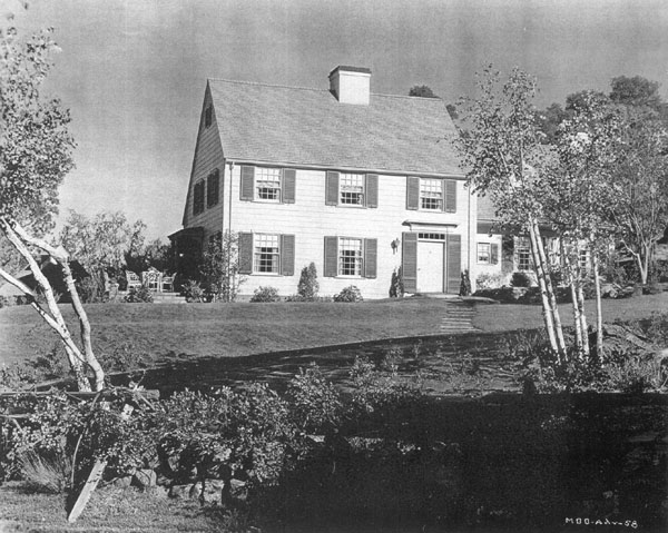

Mr. Blandings Dream Home, via CaryGrant.net

The door on Mr. Blandings house stands out as much or more! 
Candice Olson, Candice Tells All
Originally found on Buffalo Real Estate News

Candice Olson creates a fabulous room at once calm and full of drama. The fireplace stands out because of the use of high contrast with the book shelves, mirror, and lamps.


Bottom line is, to create a focal point consider contrast as much as color.  Choose paints with varying intensities. Say, a paint from the top of the strip for the trim, two shades darker for the rest of the room, and one from the bottom for an accent wall. Stand back and take a look, is there drama? If so, focal point done.


Friday, June 5, 2015

Great Walls of China

China, whether transferware, majolica, or collected ironware is a classic way to add interest to walls. Personally, consignment shops, TJ Maxx, Homegoods and eBay and Goodwill stores are favorite sources for transferware and majolica. 


James Radin

Charles Faudree
Charles Faudree was a master at symmetrical arrangements of sconces, platters and other French and English transferware. 


Charles Faudree, in French Country Signature

Kelly Weastler, Viceroy Santa Monica
Kelly Wearstler took symmetry to an new level of complexity with this stunning pattern at the Viceroy Santa Monica.


Lisa Cogdon, Dwell

Club Monaco, StepIntoTheWindow
Lisa Cogdon, Dwell
Lisa Cogdon, Dwell

Asymmetrical Patterns fascinate me and require a highly refined sense of pattern placement and development. I am scouting for a wall for just such an arrangement.

Regardless of how they are symmetrical or asymmetrical, whether in a china cabinet or hung directly on the wall, expensive antiques or special to you collections, china brings a lot of design pizzazz for the buck to a room.

Thursday, May 28, 2015

Why I Stopped Being Green

Benjamin Moore Cotton Balls from Homebunch


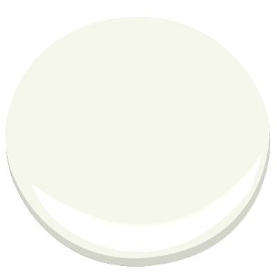
Nope, not what you think, I haven't scrapped the mulching mower. I still return my milk bottles for deposit and recycle the newspapers. I just am over that insipid off white with a green undertone that was ubiquitous in the 50's, 60's and '70's. The color was similar to Benjamin Moore Cotton Balls OC-122 / 2145-70.  I say similar, but not the same, it was a great deal "dirtier" and yet not completely grayed.


Of course there are exceptions. The gorgeous cabinets at the top of this post are painted in Cotton Balls. 

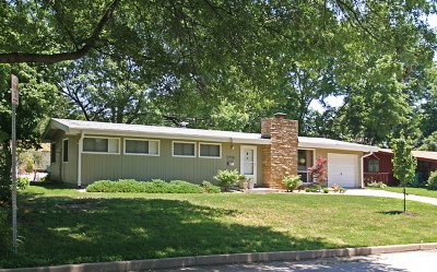
This paint goes very well with the stacked stone installations used in Mid Century modern Houses. In fact, the same house in grey could look horrible.

Mid-Century Home, in Ridgewood from B.E.L.T

The problem with this color of greyish-yellow-green-white was that it was overused. There must have been thousands of conversations just like the one in Mr. Blandings Builds His Dream House, when Mrs. Blandings asks for "a sort of grayish yellow green" among her other color specifications!

You got that Charlie?
Red, green, blue, yellow, white.


Why did these work so well? This particular combination is a lightened red, that is a tint of red, in the stone, with a tint of green. It is a classic complementary color scheme. This color scheme is somewhat tricky to pull off, too saturated and your house is like Christmas! Every Day! 
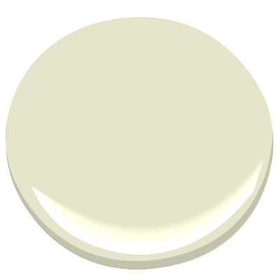
Limesickle Benjamin Moore


Over the years, stacked stone waned, fabric colors changed, yet the paint stayed the same. The  Singerie below, does not coordinate well with the color strip on which cotton balls resides. In fact, once past Limesickle, the paint begins to look muddy or dirty rather than the soft green it is.  When paired with either a gray or blue gray strips the colors work better together.


Take a look at what happens with the two images below. Next to the blue and white Chinoiserie, the paint chip looks very green and the white on the blue fabric looks yellowed. The exact same paint chip next to the smoke Chinoiserie makes the white in the fabric look crisp, while the paint shows the light gray-green shade of off white cast it truly is. Trust me, those are the exact same images of the exact same paint chip!


Moral to the story? Get a sample. Always get a sample. Then start by choosing your big ticket items first, floors are an example, upholstery is another, in neutrals. Then choose your paint and accent fabrics. Frankly, when I am working with a raw, unfinished or newly constructed space, and working on the boards, I assemble samples of everything all together in one place on a super white board to reduce color distractions. Oh, and did I tell you that you need to consider how much light does or does not stream into your space? No, well that's another blog post for another day.

Did you catch how often Schumacher has recreated this fabric?

Friday, February 27, 2015

Family Room Mood Boards


Grey and Yellow Family Room Mood Board

Moody Blues Family Room Mood Board 
I have been very busy working on the Mise en Scène Designs website. I finally found the way to incorporate the blog into the website on all three web browsers, one attempt worked for two web browsers, but not for the third. Then I had to fix the iPad version. Luckily, I have mad HTML and CSS skills, and, frankly, Google skills. Finally, I found the right answer!


Then I needed a favicon. This took very little time to design and code, and provided a finishing touch. 

In between, I created a few mood boards for a family room. Above are a Grey / Yellow accented room and a Blue accented room. 

Leave a comment and let me know your favorite! 


Saturday, February 7, 2015

Blue Skies

Ocean Air 2123-50 via Homebunch

Add caption
Benjamin Moore White Ice OC-58 IOAD LLC
Architects & Designers on
 Houzz
Benjamin Moore Winter White, OC-21, Walls, Trim Frostine, AF-5 via Boulevard Hardware


Benjamin Moore White Diamond OC-61 via Homebunch

The most likely direction I will take is to opt for one of these lighter shades, which work equally well with Elmira White and Morning Dew. These whites have just a hint of ice blue, or blue-green are just the right shade to not muddy either color. 

Saturday, January 31, 2015

Is Orange the New Pink?


Decorating with Pink / Living Room / Country Living

I heard a rumor somewhere in one of the kajillion design magazines that pour into my home seemingly daily, that pink is out and orange is the new pink. Or did I hear that in a Broadway
show? Now I am not a huge fan of pink,nor am I opposed to orange, but I rather, I can see the beauty of both.

Sarah Richardson, Sarah's House 4
Sarah Richardson, Sarah's House Season 2
Sarah Richardson via Decorpad
Sarah Richardson and Tommy Smythe created masterful pink and mauve, pink's sibling, rooms on Sarah's House.
via Eye for Design

 Both colors play supporting roles very well.
Patrick Cline/Lonny
MMR Interiors, via decorpad
They even 'play together well!'
Grant K. Gibson, Girls Bathroom via decorpad
Pink and it's sibling Purple, are colors often requested by little girls for their rooms and bathrooms.
Pink Damask, 890, Benjamin Moore
Benjamin Moore Pink Damask is in the blush section in its 2015 Color Palette.
In short, I am not ready to dump pink, but orange has definitely caught my eye.
What's your opinion? Is orange the new pink?


Saturday, January 24, 2015

Peacock Blue

Andrew Suvalsky Designs Kips Bay 2014

We are in the middle of the grey trend. Trends have a life of about 10-12 years and we are at about 5 years in for this one. Grey is a fantastic neutral. It can be warm or cool depending upon the base tone of either green (warm) or blue (cool). This can make it maddeningly difficult to purchase grey accessories for the same room, especially via online shopping. Lamps which appear warm charcoal grey on the monitor arrive and are a cool blue grey in person!

One way to combat this is to use grey as a base for the room. Walls, ceilings, floors can be the anchor, accessorized with  color. Peacock, Turquoise and Navy are also trending right now. Kips Bay 2014 featured many rooms with Peacock.
Mendelson Group Kips Bay 2014 via Architectural Digest

Cullman and Kravis Kips Bay 2014 via Architectural Digest

ODADA Kips Bay 2014 via Architectural Digest

Markham Roberts Kips Bay 2014 via Architectural Digest
Grey or other neutrals with the accent of Peacock Blue is definitely a wow, but there is no need to stick strictly to a monochromatic scheme. As Peacock Blue is a blue with some green and little or no red, an analogous color scheme for Peacock leans toward the Turquoise and Green colors of the color wheel. The rooms below are very effective analogous schemes using Peacock, Turquoise and Green.

Brian Watford Interiors via Decorpad


Mabley Handler 


L. Moore Design via Decorpad