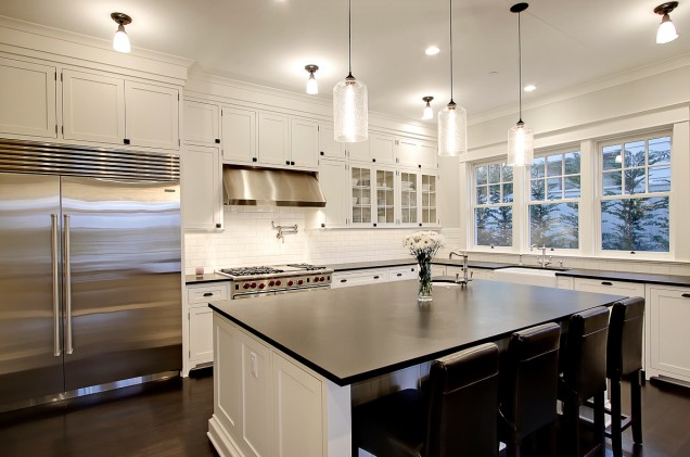
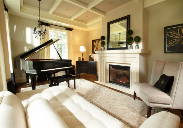
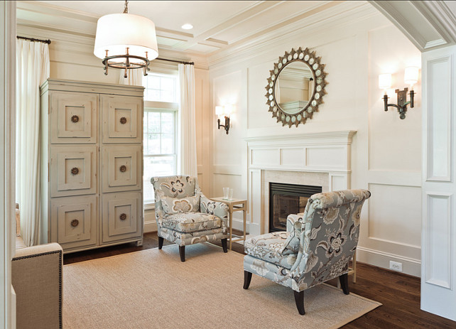
Though it involves a lot of work, move out is always a "designer party." We collaborate, commiserate and celebrate a job well done! Designers are a fantastic group of people and I am always in awe of their creativity. The camaraderie and conviviality is truly inspiring. That being said, I'm looking to tomorrow's move out and the challenges and opportunities that lie ahead.
Saturday, August 8, 2015
Saturday, August 1, 2015
The Living Room
The living room is done! This was a very quick turn around for a "show house." Typically, when I participated in the Tulsa Designer Showcase, or the Parade of Homes we toured or had the floorplans for the home several months before the Showcase was to open. We had many weeks to work on the home. In this case, we only had a few short weeks to select a room, make a plan and pull it all together.
As a reminder...
Be sure to check out the other Metamorphosis Monday posts!
Tuesday, July 21, 2015
The Plan
The plan for the space is a monochromatic, blue and white plan. The fabric, below, provides a refreshing bit of punctuation in the room.
![]() |
| 3 Park Tribal Suzani |
I visualize this space as a place for cocktails and conversation before dinner or after the theater.
It is traditional with some modern touches.
![]() |
| Danda, John Robshaw |
Chairs covered in a John Robshaw fabric anchor one side of the space.
More to come, later!
Labels:
3 Park Tribal,
3 Park Tribal Azure,
Blue and White,
Danda,
Suzani
Thursday, July 16, 2015
Home of Distinction
Pardon my poor photography, but I am so excited I couldn't wait to get the great pictures!
I am very pleased to be participating in this tour benefiting the Tourette Association! I am staging the living room. My space is the living room, a very spacious room with beautiful architectural details and finishes. The photo only hints at the beauty of this space.
Next post: the plan!
Thursday, July 9, 2015
Paint Colors, Your Mileage May Vary, Part the Middle, sort of
First, some apologies are in order. These pictures are terrible. The good news is that I do have a reason for not getting better ones.
We did get the painting done and the drapes are up.
The desk got a bit of a clearing, too.

We started with a faux Tuscan plaster finish on the walls. It was great, in its day. But the 90's are over, way over,and it had to change.The cabinets are cherry with a chocolate glaze and the countertops are Dakota Mahogany granite. As an aside, the cabinet finish choice was a
I am thinking that this compromise was a little lopsided!
As you can see there is a lot of red happening here.

Which is why the OC-140 which looked like a soft grey with some green undertones, in online pictures, and especially next to the tiles looked like so much pistachio green on the walls. So it was back to the paint deck. We tried out three additional colors, Grant Beige, HC-83, Beacon Gray and November Skies.
![]() |
| Beacon Gray |
![]() |
| November Skies |
The November Skies was the right intensity, but bluer than I wanted.
![]() |
| Grant Beige |
Grant Beige had enough green undertone to work with the warm enough and neutral enough to work with the cabinets and countertops.
I have an awesome project coming up for next post !
Saturday, June 27, 2015
Paint Colors – Your mileage May Vary
| Seattle House via Home Bunch |
One of the reasons designers are reluctant to name the paint
colors in their space is that it will look different in yours. Your space is
different. Your accessories are different. Your fabric is different. Your site
is different. Your light is different. The colors and plans for each project
are developed as part of a contiguous whole.
Before anything is even put to paper consideration is given
to how the space is used. Do you gather around the island to eat? Do you need
access to cooking.nytimes.com for recipes? Do you have young children?
Teenagers? No children? Empty nesters who host large family gatherings? Do you
entertain casually or formally? Many, many questions are asked so that the
space can work for you.
After all this, the design plan is developed. After the roughouts,
aka the bubble drawings, are done, the plan is put to paper or computer, today.
After the design is finalized, the floorplan layout is drawn, the reflective
ceiling plan is drawn, etc. etc., the color scheme is developed. The big ticket
items, usually the floors, are decided
first. These are coordinated with the cabinets or other case goods.
So you see, there are many variables. Even if you are
changing only colors, with no other planned changes, the process is more
complex than repeating a gorgeous color from a space you've seen.
Let's say you have cherry cabinets and have seen a gorgeous
space with white cabinets and Benjamin Moore OC-140, Morning Dew on the walls. Which gives the look of one of the trendy new grays you have seen.
You are in love.
But,...
You have a
member of the family, ahem husbands you know who you are, who insists the
cabinets are stained.
Trust me on this one, pairing OC-140 with Cherry Cabinets will look like so much Pistachio green
ice cream thrown up on the walls, especially in strong sunlight. Unless you plan on a
complete redo, that is, change the back splash, change the granite, paint or replace the cabinets, and change the flooring, it will
not match your vision of that picture.
Add in the complications of your space’s
lighting, both artificial and natural, which is determined in part by the orientation of your house, i.
e., darker northern light or full bake west sun, and you can have a serious
headache. All this when all you wanted was to update your paint to the newest
trendy grays!
| Rachel Reider via Houzz Traditional Staircase by Boston Interior Designers Decorators Rachel Reider Interiors |
What do I recommend? A neutral such as Benjamin Moore Greenbrier Beige, HC-83. This is a neutral which softens the edges of the super cherry cabinets, yet gives an updated look.
How do I know? Well, trust me, I know. Thing is, we know what to do to correct the error before the day is done. Next week, we may have some pictures of the story.
Hope you are having a great weekend!
Saturday, June 20, 2015
Benjamin Moore Whites
| Benjamin Moore White Chocolate Trim from Homebunch |
| Home of Lindsey Bierman Southern Living Phoebe Howard Designer |
I have used Benjamin Moore Ivory White, 925, before. Though I used it largely for trim. It is very white, though not as stark as Atrium white.
| Lynda Reeves, Canadian House and Home Benjamin Moore White Down |
| Philip Mitchell Design from TheWriterandResidence White Down, 970 |
| Dream House Studios from Homebunch Benjamin Moore White Sand 964 |
![]() |
| Maritime White Benjamin Moore 963 Old Country House |
| Lee Pruitt Memphis Magazine Maritime White, 963, Walls Bennington Gray, HC-82, Cabinets |
![]() |
| Benjamin Moore Temporal Spirit, 965 on the walls Monmouth Beach House Ivee Fromkin |
![]() |
| Ami McKay Dove Wing, 960, via Decorpad |
![]() |
| Duffy Design Group Benjamin Moore Seapearl, 961 via Decorpad |
Labels:
925,
961,
963,
965,
970,
Benjamin Moore,
Benjamin Moore Ivory White 925,
Benjamin Moore Whites,
Dove Wing,
Seapearl,
White Down
Subscribe to:
Posts (Atom)