Showing posts with label Edgecomb gray. Show all posts

Saturday, October 17, 2015

Ready Mixed Whites: Atrium White

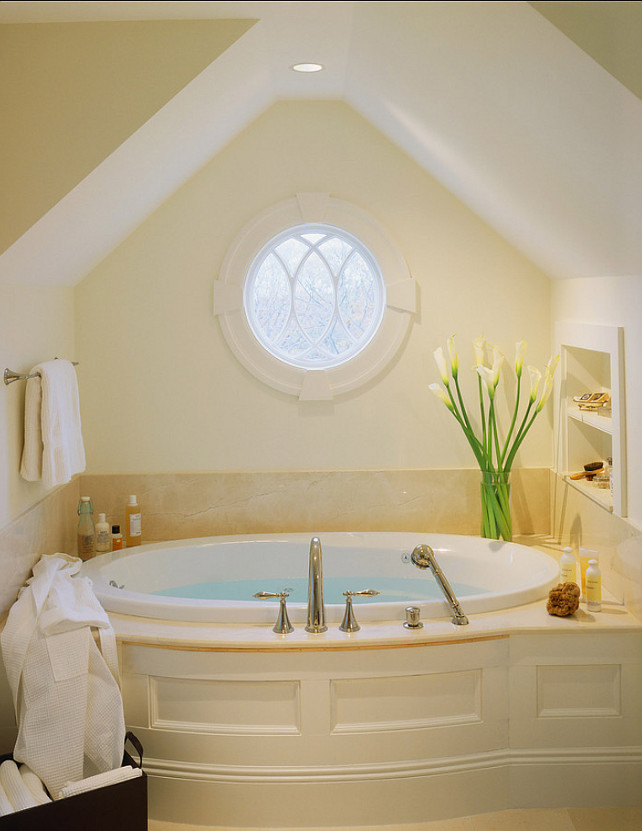
Massucco Warner Miller via Decorpad

One of my very first forays into the world of the Ready Mixed whites was Atrium White. I planned a custom paint, armed with my color choice, I walked into my Benjamin Moore paint dealer, who luckily recognized it as a ready mixed paint. This meant that I paid a bit less. 

At the time, it was a jarring transition from dark beige whites  which were in the home I was redoing. Much of the trim paint was Berber White, 955, the difference was remarkable.

Atrium White is on the far right of the Benjamin Moore Whites color gallery.


It has some slight pink undertones, which worked well with the wallpaper I planned to use above it.  It is super crisp!


Mamaroneck Kitchen & Bath Designers
Traditional Kitchen Studio Dearborn


Edgecomb Gray & Atrium White
Scavullo Design 

Though it has pink undertones, it is not a pinky-beige paint and will not have all the problems that entails. It is stunning with Edgecomb Gray as in this bath. 

However, it does pair well with some more pink cast off white colors, such as Pratt and Lambert's Soapstone from their old fan deck. I tried to find an image of this paint, but no luck!
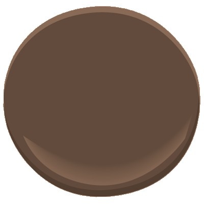
Benjamin Moore Chocolate Candy Brown, 2107-10

Atrium white works for walls and trim. For those who crave something moodier, another great pairing is with Chocolate Candy Brown, 2107-10.

Phoebe Howard
Trim is Atrium White
Mrs Howard Personal Shopper
Tom Scheerer
via
The Peak of Chic


Chocolate browns also have a significant red base. So it really is an inspired combination.

What do you think? Is there a place for Atrium White in your home?


Friday, September 4, 2015

Guggenheim

via Homebunch

I was searching the web for photos of cabinets painted with the no longer a secret combination of 50% linen white and 50% decorators white. The above picture is not it, it is linen white only. I know that once in Traditional Home, this charmingly awesome 50-50 was used and actually named as such. So often when a mix is listed in the Resources, it is just listed as Custom, grrrr!

Admittedly I have made some spectacular beige / off white paint colors by mixing all the left over paints together. Yup even some intense colors, mixed together with a bit of white will make beige. And, no, I couldn't come up with a better name than "custom" either. How do you say, about a quart of a gallon of some perfectly awful green that just never quite worked, about 1/2 gallon of brown that the previous owners left behind, 2 quarts of some sort of red, trial colors for the accent walls, a gallon of atrium white which was over the top stark, and a half a gallon of soapstone which a pinkish off white for the ceiling in the room with the Schumacher wallpaper.
Edgecomb Gray Decorpad 

While wandering I found an article on the New York Times site dating from 1989, with a discussion about whites, including the newly introduced Atrium White! Benjamin Moore's Off-White, with the number #76, which was really a gray, was only being kept in the line because of the name, off-white. I wonder how close that gray was to Edgecomb? I'm sure it was close to the stunning ET-69 or was it ET-71, which we used in our first house. I remember those colors being very close to Revere Pewter and Edgecomb Gray. I am pretty sure that #76 was in fact an ET, which stood for earth tone, color. 


Atrium White Cabinets via Decorpad


Atrium was one of the most stark whites I'd used to date. 

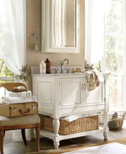
Pottery Barn, Benjamin Moore Spring in Aspen #954 on the walls OC-117 Simply White Trim
Benjamin Moore Spring in Aspen #954 with White Dove OC-17
Benjamin Moore Spring in Aspen #954 with Brandon Beige # 977
via Pinterest

From the article, it seems that the Guggenheim was painted OW-8, which was renamed #954, or, by its name, Spring in Aspen. To me, the Spring in Aspen works better with a brighter white for trim, such as the OC-117 in the top picture or the Brandon Beige in the bottom picture. White Dove, which I love is too near the same tone. If a monochromatic look is desired, just use the same paint in a different gloss, say satin, for the wood work.
Pottery Barn,
Benjamin Moore Berber White, 955

Benjamin Moore's Berber White, its neighbor on the fandeck, was very popular when it was part of the Pottery Barn color selections.

I'll keep looking for that elusive 50%-50% Linen / Decorators white photo, in the meantime, I have some plans up my sleeve for that boring builder bathroom!