 |
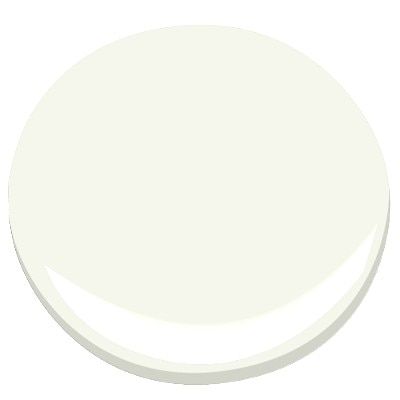
| Benjamin Moore Cotton Balls from Homebunch |
Nope, not what you think, I haven't scrapped the mulching mower. I still return my milk bottles for deposit and recycle the newspapers. I just am over that insipid off white with a green undertone that was ubiquitous in the 50's, 60's and '70's. The color was similar to Benjamin Moore Cotton Balls OC-122 / 2145-70. I say similar, but not the same, it was a great deal "dirtier" and yet not completely grayed.

Of course there are exceptions. The gorgeous cabinets at the top of this post are painted in Cotton Balls.
This paint goes very well with the stacked stone installations used in Mid Century modern Houses. In fact, the same house in grey could look horrible.
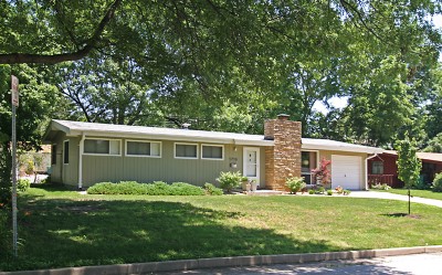 |
| Mid-Century Home, in Ridgewood from B.E.L.T |
The problem with this color of greyish-yellow-green-white was that it was overused. There must have been thousands of conversations just like the one in Mr. Blandings Builds His Dream House, when Mrs. Blandings asks for "a sort of grayish yellow green" among her other color specifications!
You got that Charlie?
Red, green, blue, yellow, white.
Why did these work so well? This particular combination is a lightened red, that is a tint of red, in the stone, with a tint of green. It is a classic complementary color scheme. This color scheme is somewhat tricky to pull off, too saturated and your house is like Christmas! Every Day!
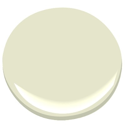 |
| Limesickle Benjamin Moore |
Over the years, stacked stone waned, fabric colors changed, yet the paint stayed the same. The Singerie below, does not coordinate well with the color strip on which cotton balls resides. In fact, once past Limesickle, the paint begins to look muddy or dirty rather than the soft green it is. When paired with either a gray or blue gray strips the colors work better together.
 |
 |
 |
Take a look at what happens with the two images below. Next to the blue and white Chinoiserie, the paint chip looks very green and the white on the blue fabric looks yellowed. The exact same paint chip next to the smoke Chinoiserie makes the white in the fabric look crisp, while the paint shows the light gray-green shade of off white cast it truly is. Trust me, those are the exact same images of the exact same paint chip!
|
|
 |
|
|
 |
Moral to the story? Get a sample. Always get a sample. Then start by choosing your big ticket items first, floors are an example, upholstery is another, in neutrals. Then choose your paint and accent fabrics. Frankly, when I am working with a raw, unfinished or newly constructed space, and working on the boards, I assemble samples of everything all together in one place on a super white board to reduce color distractions. Oh, and did I tell you that you need to consider how much light does or does not stream into your space? No, well that's another blog post for another day.
Did you catch how often Schumacher has recreated this fabric?
No comments:
Post a Comment