 |
| Jane Greer and William Holden Out of the Past via The Film Stage |
Black and White Movies made great use of contrast to create a sense of tension or drama in a scene. Dark played against light draw the eye to the action in or mood of the scene. Notice how your eye focuses on the faces above, you find yourself wondering, what is going to happen next?
 |
| Last Year at Marienbad via linstudio |
 |
| The Colors in the Room, Last Year at Marienbad via The Criterion Collection |
 | ||
| Jane Lockhart, via Homebunch Kendall Charcoal HC-166
|

 |
| Benjamin Moore, Caponata AF 650 on walls Trim & Ceiling Chantilly Lace, OC-65 |
 |
| Benjamin Moore, Grayscale |
 |
| Joanne Smith Design, from Home and Garden Design Ideas |

The island, lights and stools become one block of dark color, nearly the same intensity. The colorful greenery near the sink still has some contrast to the white cabinets, but there is little else to draw your eye away to the stove area. Though the first picture is refreshing and calm, the second, in grayscale, is loaded with drama.
 |
| Real Simple, via Inspired Hue |

This one should come as no surprise. The blue-green and the gray are the same intensity. With no color, the white dishes barely stand out! However, this was a surprise:
 |
| via Inspired Hue |

The door just doesn't stand out as much as it does in color!
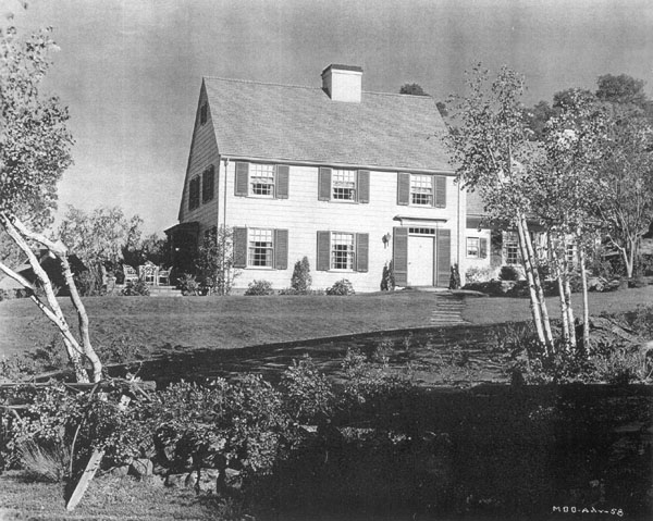 |
| Mr. Blandings Dream Home, via CaryGrant.net |
The door on Mr. Blandings house stands out as much or more!
 |
| Candice Olson, Candice Tells All Originally found on Buffalo Real Estate News |
Candice Olson creates a fabulous room at once calm and full of drama. The fireplace stands out because of the use of high contrast with the book shelves, mirror, and lamps.

Bottom line is, to create a focal point consider contrast as much as color. Choose paints with varying intensities. Say, a paint from the top of the strip for the trim, two shades darker for the rest of the room, and one from the bottom for an accent wall. Stand back and take a look, is there drama? If so, focal point done.
No comments:
Post a Comment