 |
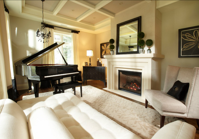
| Seattle House via Home Bunch |
One of the reasons designers are reluctant to name the paint
colors in their space is that it will look different in yours. Your space is
different. Your accessories are different. Your fabric is different. Your site
is different. Your light is different. The colors and plans for each project
are developed as part of a contiguous whole.
Before anything is even put to paper consideration is given
to how the space is used. Do you gather around the island to eat? Do you need
access to cooking.nytimes.com for recipes? Do you have young children?
Teenagers? No children? Empty nesters who host large family gatherings? Do you
entertain casually or formally? Many, many questions are asked so that the
space can work for you.
After all this, the design plan is developed. After the roughouts,
aka the bubble drawings, are done, the plan is put to paper or computer, today.
After the design is finalized, the floorplan layout is drawn, the reflective
ceiling plan is drawn, etc. etc., the color scheme is developed. The big ticket
items, usually the floors, are decided
first. These are coordinated with the cabinets or other case goods.
So you see, there are many variables. Even if you are
changing only colors, with no other planned changes, the process is more
complex than repeating a gorgeous color from a space you've seen.
Let's say you have cherry cabinets and have seen a gorgeous
space with white cabinets and Benjamin Moore OC-140, Morning Dew on the walls. Which gives the look of one of the trendy new grays you have seen.
You are in love.
But,...
You have a
member of the family, ahem husbands you know who you are, who insists the
cabinets are stained.
Trust me on this one, pairing OC-140 with Cherry Cabinets will look like so much Pistachio green
ice cream thrown up on the walls, especially in strong sunlight. Unless you plan on a
complete redo, that is, change the back splash, change the granite, paint or replace the cabinets, and change the flooring, it will
not match your vision of that picture.
Add in the complications of your space’s
lighting, both artificial and natural, which is determined in part by the orientation of your house, i.
e., darker northern light or full bake west sun, and you can have a serious
headache. All this when all you wanted was to update your paint to the newest
trendy grays!
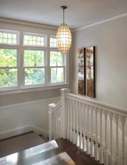 |
| Rachel Reider via Houzz Traditional Staircase by Boston Interior Designers Decorators Rachel Reider Interiors |
What do I recommend? A neutral such as Benjamin Moore Greenbrier Beige, HC-83. This is a neutral which softens the edges of the super cherry cabinets, yet gives an updated look.
How do I know? Well, trust me, I know. Thing is, we know what to do to correct the error before the day is done. Next week, we may have some pictures of the story.
How do I know? Well, trust me, I know. Thing is, we know what to do to correct the error before the day is done. Next week, we may have some pictures of the story.
Hope you are having a great weekend!