 |
| via Homebunch |
I was searching the web for photos of cabinets painted with the no longer a secret combination of 50% linen white and 50% decorators white. The above picture is not it, it is linen white only. I know that once in Traditional Home, this charmingly awesome 50-50 was used and actually named as such. So often when a mix is listed in the Resources, it is just listed as Custom, grrrr!
Admittedly I have made some spectacular beige / off white paint colors by mixing all the left over paints together. Yup even some intense colors, mixed together with a bit of white will make beige. And, no, I couldn't come up with a better name than "custom" either. How do you say, about a quart of a gallon of some perfectly awful green that just never quite worked, about 1/2 gallon of brown that the previous owners left behind, 2 quarts of some sort of red, trial colors for the accent walls, a gallon of atrium white which was over the top stark, and a half a gallon of soapstone which a pinkish off white for the ceiling in the room with the Schumacher wallpaper.
 |
| Edgecomb Gray Decorpad |
While wandering I found an article on the New York Times site dating from 1989, with a discussion about whites, including the newly introduced Atrium White! Benjamin Moore's Off-White, with the number #76, which was really a gray, was only being kept in the line because of the name, off-white. I wonder how close that gray was to Edgecomb? I'm sure it was close to the stunning ET-69 or was it ET-71, which we used in our first house. I remember those colors being very close to Revere Pewter and Edgecomb Gray. I am pretty sure that #76 was in fact an ET, which stood for earth tone, color.
 |
| Atrium White Cabinets via Decorpad |
Atrium was one of the most stark whites I'd used to date.
 |
| Pottery Barn, Benjamin Moore Spring in Aspen #954 on the walls OC-117 Simply White Trim |
 |
| Benjamin Moore Spring in Aspen #954 with White Dove OC-17 |
 |
| Benjamin Moore Spring in Aspen #954 with Brandon Beige # 977 via Pinterest |
From the article, it seems that the Guggenheim was painted OW-8, which was renamed #954, or, by its name, Spring in Aspen. To me, the Spring in Aspen works better with a brighter white for trim, such as the OC-117 in the top picture or the Brandon Beige in the bottom picture. White Dove, which I love is too near the same tone. If a monochromatic look is desired, just use the same paint in a different gloss, say satin, for the wood work.
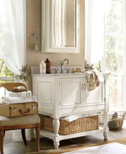 |
| Pottery Barn, Benjamin Moore Berber White, 955 |
Benjamin Moore's Berber White, its neighbor on the fandeck, was very popular when it was part of the Pottery Barn color selections.
I'll keep looking for that elusive 50%-50% Linen / Decorators white photo, in the meantime, I have some plans up my sleeve for that boring builder bathroom!
No comments:
Post a Comment